
LMS UX Mockups
Oh boy was I excited when someone on the Product & Technology team asked if I had any ideas for the look and feel of the LMS experience. UX was something I’d been interested in years, but never pursued because a lot of my talents and passions were related to learning and training. And here I got to really focus on both.
Researching the Problem
I started by doing research on The Problem. This started, of course, with the learners themselves. That was our audience, but they weren’t the only ones we needed to keep in mind. The other stakeholders in The Problem included us as instructional designers, and the LMS administrators. No matter how elegant the solution is for the user/learner, if it’s too difficult to sustain on the backend, it won’t get sustained.
All in all we used one-on-one interviews, focus groups, surveys, and observations to come up with as many issues as we could find.
Falling Back on the Brand
I categorized the main qualms with the existing experience and lined them up against the words from our brand. Were we truly representing our brand well when our stakeholders are having all these troubles? How can we use our brand guidelines to help us design solutions?
Personas
I love creating and using personas. The intersection of user experience, learning design, and writing appeals to me. From the research, here are the personas I came up with:
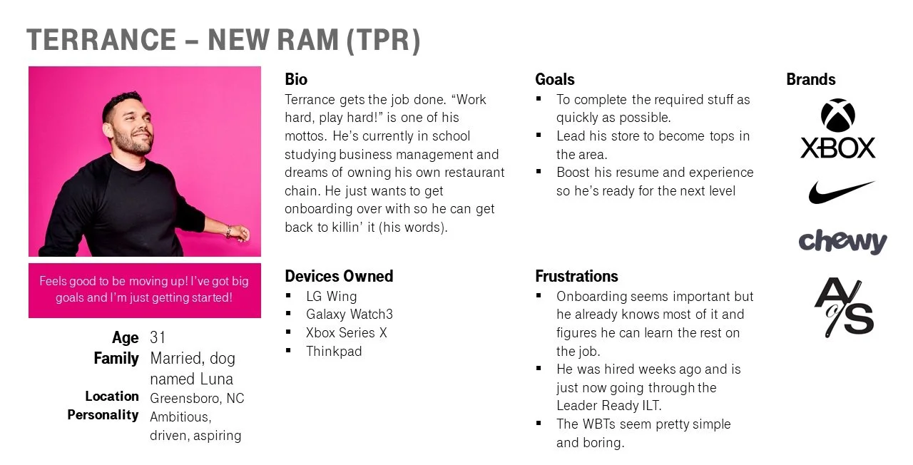
Larissa | New Associate Manager. Larissa is very friendly and outgoing, and her natural charisma has led to becoming the top performer in her region and an obvious choice for a promotion. However, her natural sales skills doesn’t translate to leadership, and she’s pretty nervous about the added responsibility.
Paula | LMS Admin. Paula has always been the computer nerd but most people who meet her are surprised by that. People who don’t know her say she’s quiet. People who do know her think she’s the funniest, most interesting person they’ve ever met.
Fran | Facilitator. Fran likes to say that she’s the typical retail story: started as a rep, then associate manager, store manager, training store manager, and then made the jump to training. As much as she loved working the frontline, she loves helping others work the frontline even more.
Ian | Instructional Designer. Ian got a BFA in Graphic Design but once his first kid came along, he decided he needed something steadier, and found a new passion in instructional design. He’s always looking for ways to make his work more aesthetically pleasing.
These personas guided us as we brainstormed possible solutions as a team.
Solutions Brainstorm
You know how a brainstorm works. Throw out ideas. No qualifying them, just throw them out there and deal with them later. Aside from review feedback, this was the only part of this project that was done as a team. The solutions were then deleted and prioritized, then turned into user stories.
The Design
For every user outside of the learner, the outcome of this exercise became much of the program branding guidelines (a separate project in the portfolio). The learners got this LMS front-end design.
To start, we needed some flowcharts.
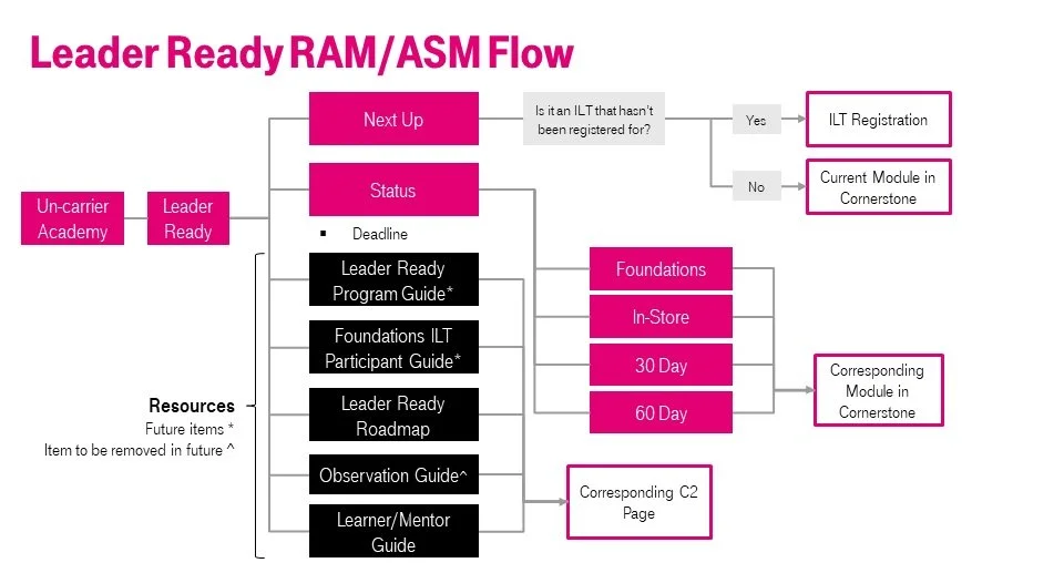
My number one feature, after all the research, the personas, and the brainstorming, was a ‘Next Up’ button. In our efforts to simplify and streamline the learner to be able to quickly access their required training, it just made sense to pull whatever the very next learning object was, and put it front-and-center.
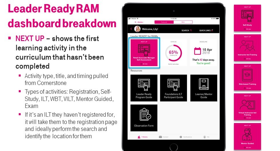
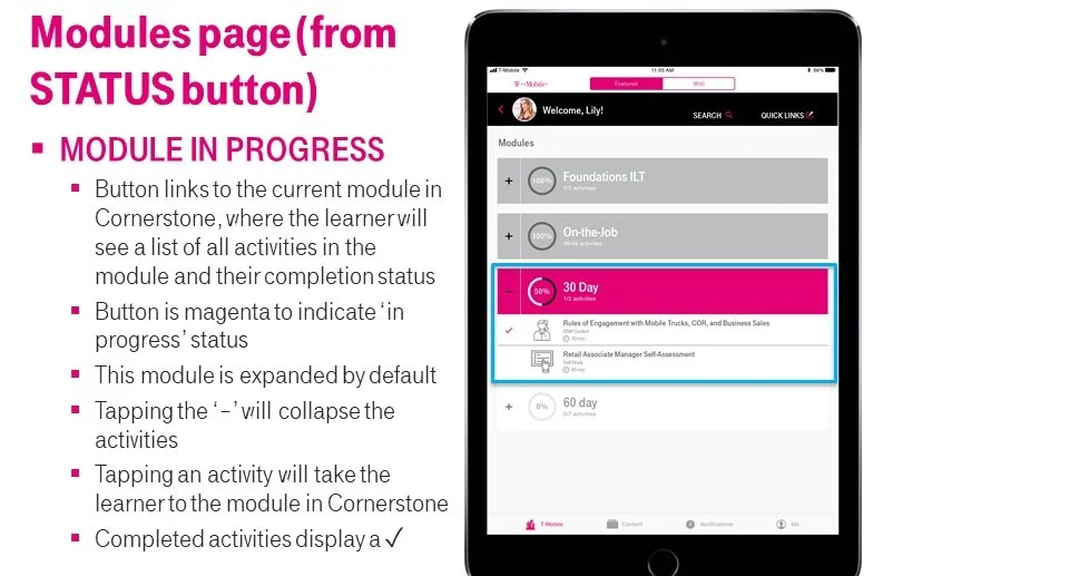
If you didn’t want to just do the next thing on your list, you could tap the status button to bring up the entire curriculum.
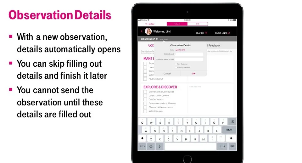
New leaders needed to be certified to demonstrate not that they had completed the program, but that they could be trusted to run a store. We had been using a PDF observation guide for the hiring manager to use, but to get it uploaded into the system was a pain, so part of this design was to incorporate a digital observation guide.
I really got to delve into some Apple design guidelines, which was pretty fun.
Lessons Learned
This project was actually more like three or four projects, spanning a few years, rolled into one. The primary lesson learned for me was the relationship between UX designers and developers. You can make all the pretty designs and interactions you want, but creating them on the back end isn’t that simple, so you have to really understand the reasoning behind the design choices you make, and more importantly you need to be able to communicate that to the developers so the product they create most closely resembles the best experience for the user, not your pretty designs.