
Retail Leadership Branding Guide
When you have a big program supported by multiple designers, branding is key. Not just the look of the training, but the writing style and the structure. You want to have a cohesive style throughout your content. That’s the easy part. The hard part is making it easy to follow so instructional designers of all backgrounds can create beautiful, on-brand content.
But first, I had to sell it. Why change up the look and feel of our training content? What’s the big deal?
Here’s the full outline, though I’ll only be showing a selection of slides:
Title
Outline
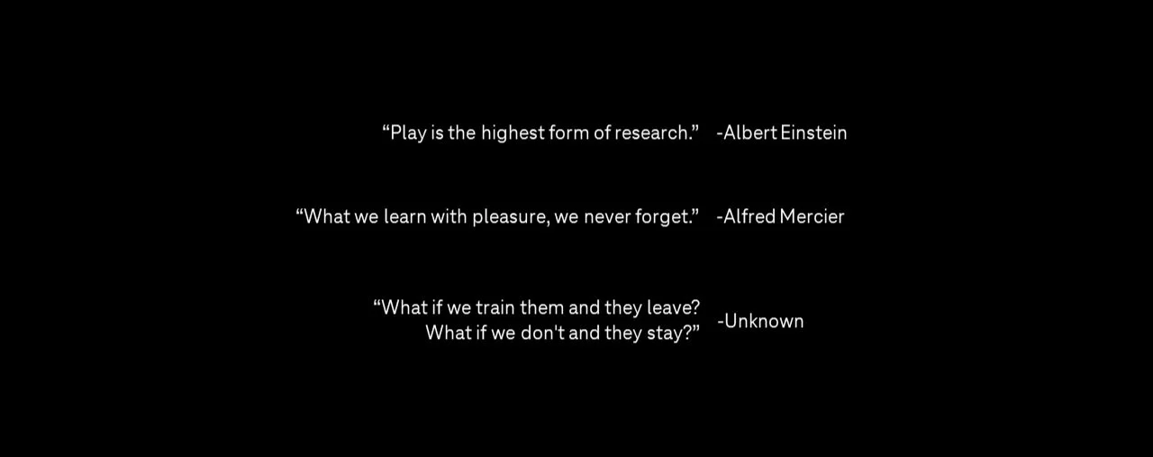
Inspirational Quotes
Mission Statement
Program & Structure
The Pillars of the Program
The Program’s Coaching Habits
The Program Basic Structure
The Program Skill Tree
Brand Basics
The Program Brand Words
Brand Look & Feel
Tone of Voice
Terminology
Color
Images
Icons
Brand in Action
Slides
Job Aids
Web-based Training
Facilitator Guide
PROGRAM & STRUCTURE
Our program has gone through a lot of changes. It evolved from a bunch of requirements on a spreadsheet, to a five day ILT, to a one hundred and twenty day basics & advanced curriculum, to a thirty day program with a two day ILT. It keeps changing because we’re responding to the needs of the business as well as the abilities of the technology and our training teams.
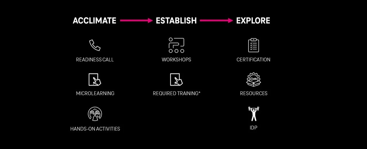
I came up with this program structure because something we kept forgetting is they keep adding and changing retail leadership roles—all of which we’re in charge of onboarding—and we needed a formula to fall back on anytime they told us a new role was coming… last week. The formula, as you can see above, is ACCLIMATE → ESTABLISH → EXPLORE, each with a subset of expected learning activities.
I asked myself (and the team), “What do they need to know their first week, month, and year on the job.” You can probably survive a week without knowing a lot about coaching, but if you don’t know how to correctly close a store, you could get in a lot of trouble. We also had a reality of what I like to call battlefield promotions, where suddenly you find yourself without a store manager so the associate manager has to take over.
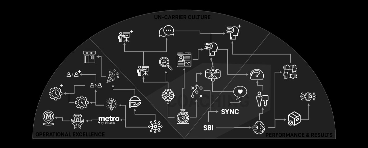
We supported upwards of 20 different retail leadership roles, which were changing all the time. Many of the promotions were linear, many were not. A lot of what you need to know from an associate manager to a market manager will crossover in a general sense, but a lot of specifics are very unique to each role. I wanted to capture that these skills built upon one another, arranged in three categories: CULTURE, RESULTS, and OPERATIONS, with a little COACHING segment that spans Culture and Results.
Another function of the skill tree was to visualize what someone would need to train on if they were external hires, lateral moves, or legacy roles. With each skill mapped to a specific role, you could see what additional training they would need beyond the regular onboarding program.
People tend to glamorize choose-your-own-adventure learning, and I for one am very inspired by open world and RPG video games. Something I learned early on as a teacher is that learners need structure, they need a main quest, if you will, before you can let them loose to choose what they want to do. As such, another function of the skill tree would be to show learners what might be next for them in their leadership journey, and perhaps help them decide on a path to take going forward.
BRAND BASICS
When it came to the rules of the look and feel of our brand, I started with a guide our Marketing team put out. It worked well enough, but it was geared toward external marketing (obviously) and didn’t take into account that, from the learning & development teams’ perspective, our customers are our employees.
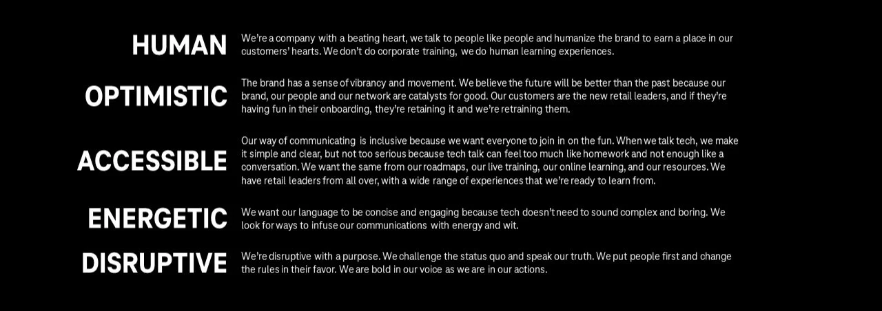
These brand words, especially, were a great starting point. These words illustrated how we wanted our customers to feel about us, and they naturally go hand-in-hand with how we wanted our employees to feel about the company they worked for.
I also appreciate the value of guiding principles. We can get bogged down sometimes with precise colors or icon designs or resolutions and it’s important to step back and remember that, in the end, we’re striving for learning materials that are Human, Optimistic, Accessible, Energetic, and Disruptive.
I could say a lot about each of these words but one of my favorites is Human. So much of corporate training is inhuman. You want to tick all of the legal boxes and hit every one of the SME’s objectives that you forget to make a human connection. Once upon a time, training and onboarding was just someone showing you how to do stuff, side by side, and I think we forget that what made that style of training so effective was the human connection.
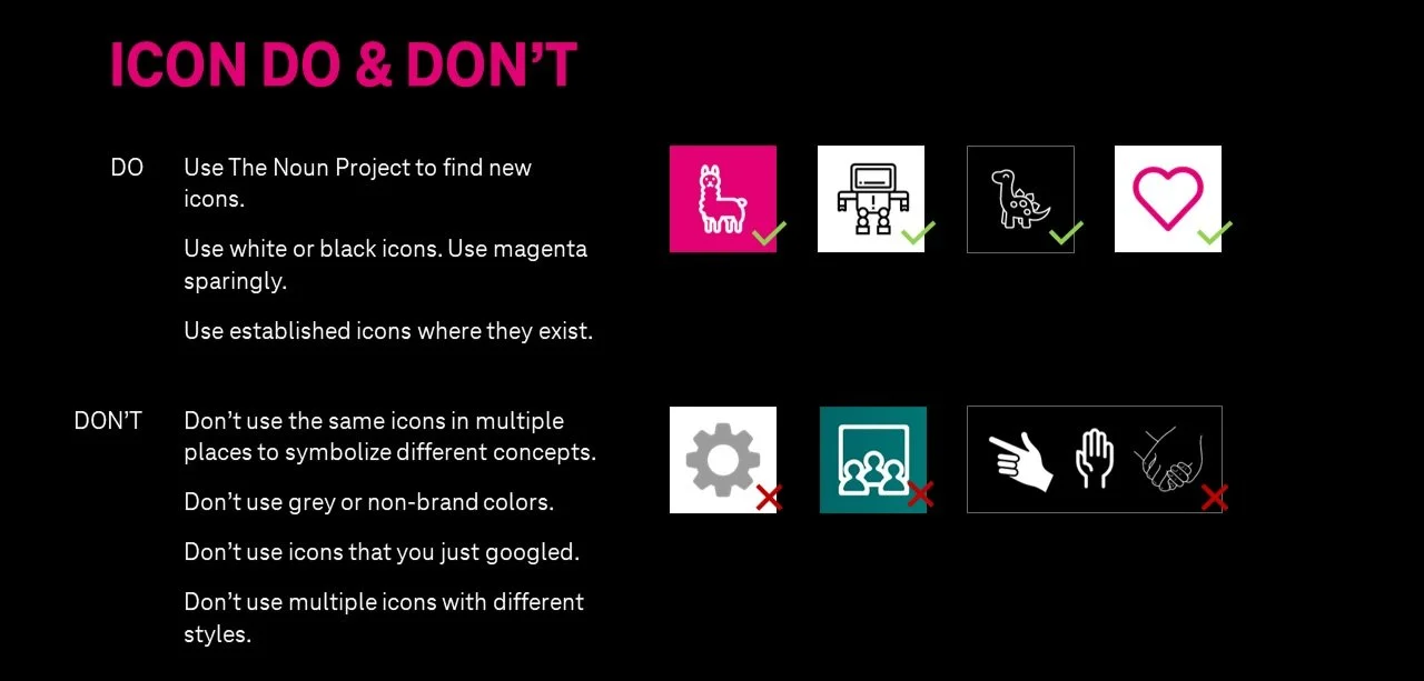
There are various ways you can categorize and understand motivation, but I subscribe to Dan Pink’s: Autonomy, Mastery, and Purpose. I bring that up because the image above shows how we want consistent icon use throughout our content but we’re not telling them exactly which icons they can and can’t use. Autonomy is important, and if we want designers making human connections with learners, they need to be able to make their own choices. This is how I tried to find the balance between that autonomy without losing brand cohesion, and vice versa.
BRAND IN ACTION
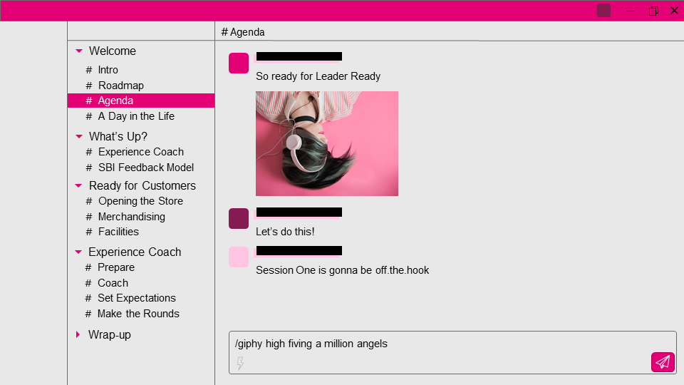
The Brand in Action section is not a collection of templates, it’s some examples of how we can use font, color, icon, and imagery to fit our brand words: Human, Optimistic, Accessible, Energetic, and Disruptive. What if the Agenda slide looked like Slack? What would the color scheme be? How could you give the feeling of Slack without just making a carbon copy of it?
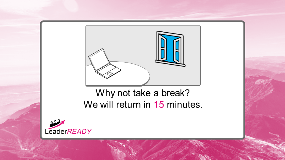
What if the Break slide looked like the Wii Sports screen that told you to get some fresh air? Can we use blue to illustrate the sky, even though it’s not one of our approved brand colors?
These Brand in Action examples were just my ideas, designed to spark ideas from the other designers. Something I’m becoming more and more aware of every day is that individuals can have good ideas and do good work, but it’s not until you team up that you can start having great ideas and doing great work. That’s what the Branding Guide was trying to accomplish.