
MrCollett.net
My teacher website, preserved through the web since June, 2015.
Click/tap to go check it out in all its seven-year-old retro glory, or read on to see my process.
My old teacher website showcases user experience design, web design, graphic design, and learning experience design.
USER EXPERIENCE DESIGN
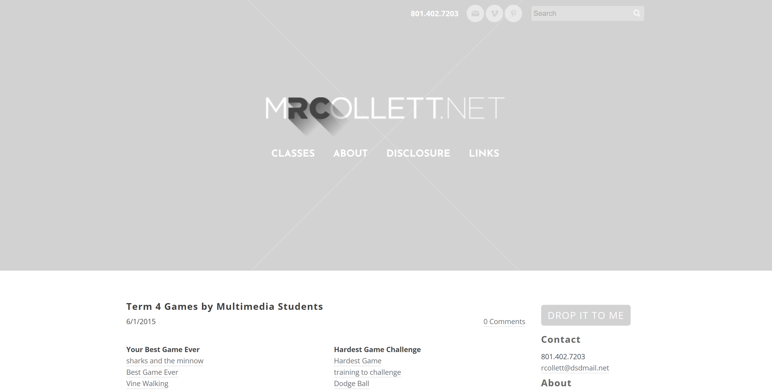
The site went through multiple iterations as I learned more about the users (my students and their parents), what they needed access to on the ‘front page,’ and everything else. I discovered that it was its most powerful as a showcase of student work and as a hub for announcements and links, and the very last post was used to share links to computer games created by my multimedia students for others to check out and rate. Everything else someone might be looking for is only a click or two away, like the Disclosure Documents, my contact information, a little bit about my classes, and a hub for all the links my students and their parents would need in any of my classes.
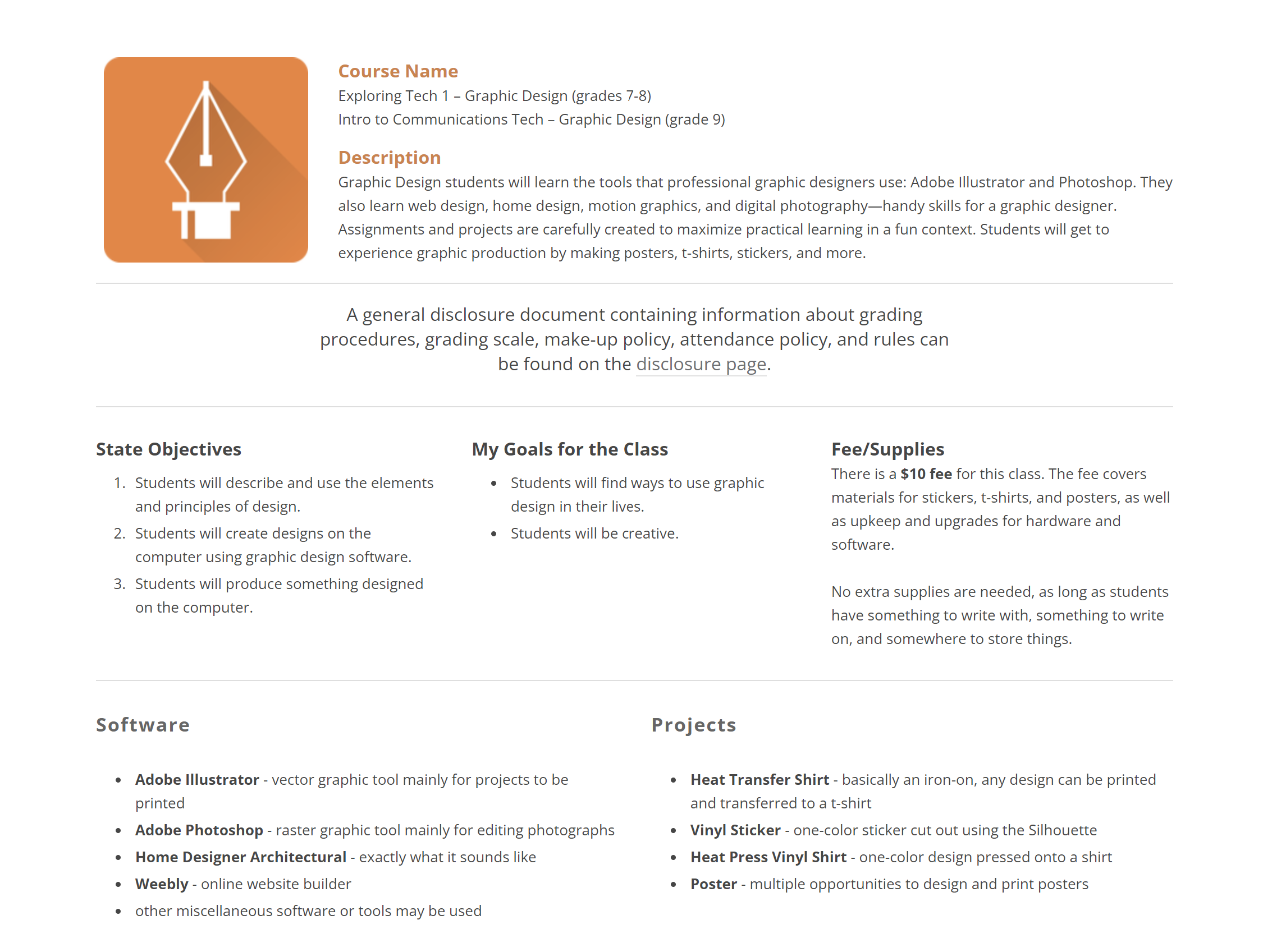
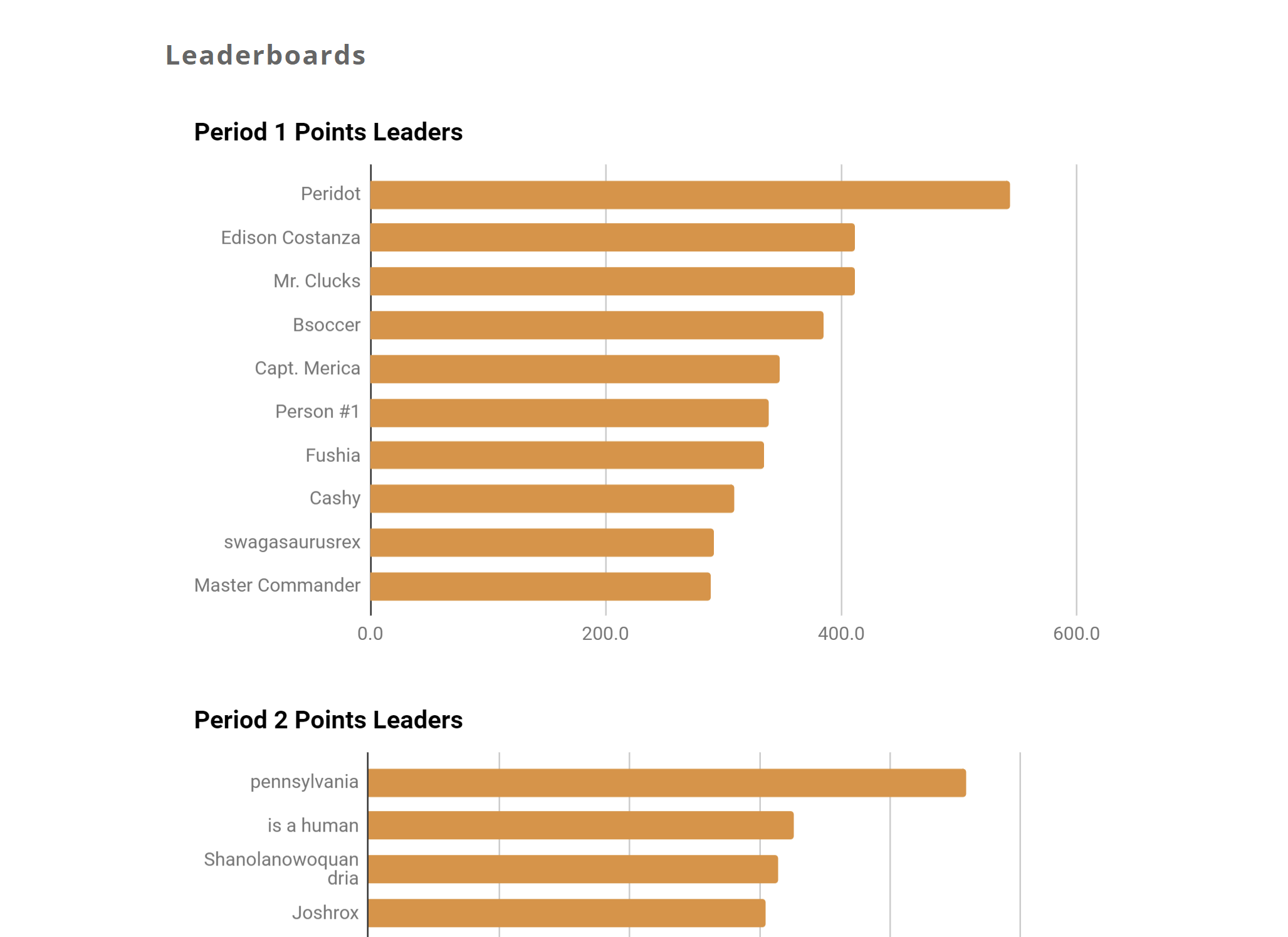
I utilized a lot of redundancy in order to ensure my students and parents always ended up in the right place. For example, if you click ‘CLASSES,’ you’ll see a simple list of the four subjects I taught, with a quick link to the Disclosure form. Each class page itself was a Disclosure Document, which, conveniently, outlined the curriculum for that class. On that same class page you could find leaderboards. I made that decision again to eliminate clicks, as well as serve as a subtle reminder of the expectations and curriculum for the class every time they wanted to see where they stacked up.
WEB DESIGN
I selected Weebly as my platform primarily for its ability to create and manage student accounts so my students could create their own websites. Its WYSIWYG interface was comparable to many other website builders out there, and I find that it’s a matter of exploring its template and formatting abilities to find that perfect balance of what I want it to look like, and what’s easy to maintain. It’s tempting to get carried away by creating a flashy landing page, for example, but as I described above, that was unnecessary for my students, and ended up going with a much simpler interface based around the blog functionality of Weebly.
GRAPHIC DESIGN
It’s true that I was somewhat limited by the platform, but there’s a lot to be said for the graphics and colors. One thing I love to do in pretty much all of my work is create consistent and color-coded graphics to both unify yet differentiate. For example, each class had its own logo. I chose a rounded-corner square with a simple white icon and long shadow over it. Then, each class had its own color.
For my Graphic Design class (seen below) I chose the Pen Tool from Adobe Illustrator as my primary icon, and orange because it represents creativity, plus it relates to the yellow of Illustrator’s branding, and it’s my favorite color. My other classes were Multimedia (blue, because we had a heavy emphasis on computer software and the darker color felt more ‘cinematic’), Yearbook (red for school colors), and National Academic League (green for growth).
LEARNING EXPERIENCE DESIGN
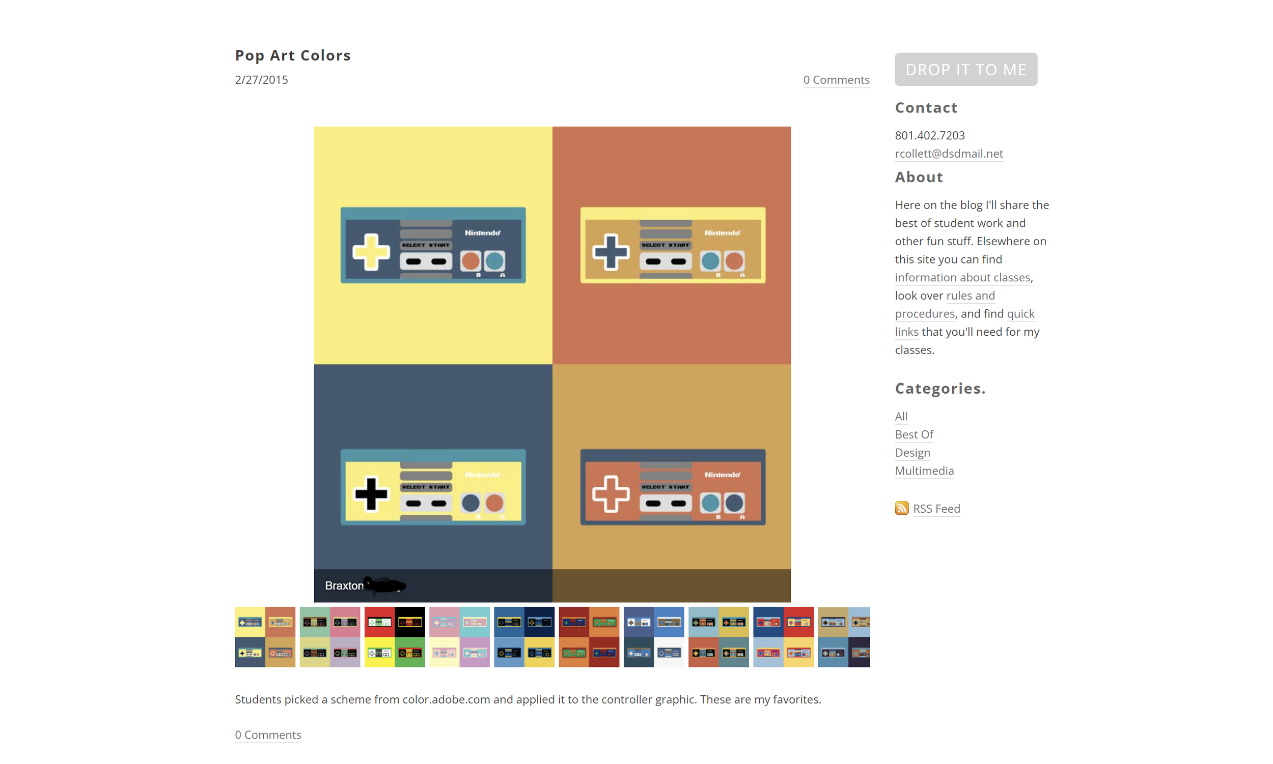
I never stop learning, and the subject that fascinates me more than almost anything is how people learn. One day I had the idea to print out some of my favorite student work from my Graphic Design periods, and the students were obsessed. They’d see photos pinned to the wall and they’d rush to it, partly to see if anything of theirs made the wall, partly just to see what I deemed ‘good,’ because that will help them start building up a mental database of better design.
The printouts were great, but my Multimedia students quickly pointed out that the majority of their work wasn’t featured. I was also limited by wall space, and I didn’t want too much visual clutter, so featuring student work on my website was an obvious solution. I could link to or embed computer games (they were Flash-based back then so they don’t work anymore), embed student-created videos, and just post more stuff overall.
I learned from another teacher that you can create and embed student leaderboards using Google Sheets. As a big fan of video games and an avid proponent (and critic) of gamification to enhance learning, I quickly applied it to my classes. I wanted it to be a fun way for students to compete without any of the negativity. Also, of course, to preserve privacy I had everyone create a pseudonym at the beginning of the semester.
It took a bit of work, especially when I was already managing a gradebook in our official district software and Canvas, but I figured out a system where I could grade the work they turned in to Canvas LMS, sort, then copy and paste the cells right into Sheets. The leaderboard automatically updated on my website when the spreadsheet was updated.
As I leaned more and more into Canvas LMS, I needed the website less and less. I still used it to feature student work, but announcements, files, and links were more easily shared via LMS. I suppose that’s inevitable with any kind of user or learner experience design: you constantly learn and iterate until you render a previously revolutionary solution obsolete.
But it still looks cool right?